"I take orders from the Octoboss."

The big question

Half the fun of writing is all the emails I get, so I think it’s a good idea to finally catch up with modern computertational technology and have comments. That means I gotta transfer over to this “blog” format here, but I don’t want it to look the way it does now. Too slick. So I’m gonna try to figure out how to make it my own (looks hard).

Anyway here’s my biggest question: should I keep the dark background in honor of the crappy-even-for-1999 look I have always been so proud of, or should I lighten it up to make it easier on the eyes? That was a request I got from somebody long ago and I think it might be time to take the plunge but I wanted to run it by everybody first.

Also, any other general comments about changing the look for the first time in like 8 or 9 years. Is everybody emotionally prepared for a change like this?

This entry was posted on Tuesday, April 14th, 2009 at 11:10 am and is filed under Site News. You can follow any responses to this entry through the RSS 2.0 feed. You can skip to the end and leave a response. Pinging is currently not allowed.

42 Responses to “The big question”

  1. While I love the ’90s Geocities style, I think it might be time to evolve just slightly. I’m sure you can find a way to make the new site both slick and hard. Like a T-1000.

  2. Keep the background. It fits into your rebel “I don’t give a shit what is supposedly hip or not” vibe, and why rid totally of something good?

  3. I say stick with it. Even though the whole black background gives me spot in the eyes.

    No pain, no gain.

  4. Yeah, I liked the dark background. Don’t change.

  5. DESTRUCTION FOUTUE TOTALE

    April 14th, 2009 at 2:46 pm

    Hé Vern. Ventilateur énorme ! ! C’est un un Vern dur. Un l’une main il fait un dégage un ” ; Je ne donne pas un fuck” ; type de vibe. D’une part si le reste de votre emplacement va être mis à jour alors vous devriez l’une ou l’autre mise à jour TOUTE de elle….ou ne pas la mettre à jour du tout. Au moins c’est la manière que je me sens. Autrement vous courez le risque de perdre votre attitude insousiante avec des venus.

  6. I really like the look. I have never really understood the idea that it looks bad anyway.

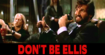
  7. Personally I find a black background easier on the eyes than staring at a light bulb. I usually invert the colors on my monitor when I’m using a word processor anyway. I assumed you were just being considerate since your reviews typically run 5000 words and had no idea people were actually complaining about this. Wherever you fall on this background color issue please ensure that the site retains the designed-by-an-ex-con look, and also please ensure your Don’t Be Ellis graphic remains prominently featured always and forever. Keep up the good work Vern

  8. I’ve always found white-text-black-background easy on the eyes. Plus it’s a great look.

  9. Well, I think it’s unanimous then. Chris is gonna help me make this Word Press deal look kind of like the old one, but he’s doing it out of kindness so it will be a bit. Until then feel free to read the classic.outlawvern version which still has the Don’t Be Ellis.

  10. Do whatever makes the site easiest to read. We are all with you brother.

  11. Just a quick note to Vern and everyone else, if you’d like a nifty avatar next to your post go sign up at http://gravatar.com and link however many email accounts as you like. Then when you post to sites that support Gravatars (like most WordPress and other sites) your itty-bitty little pic will show up automatically!

  12. Can you still do that thing where you see who came across your sight because they Googled “K-Y sheeps blood home stereo speakers” or “grandmas vomiting butter”?

    I figured that since you have a dot-com now, it might be a good idea to start the list over. Maybe even after some time, put the lists side by side and compare the two.

  13. Am glad you’re planning to go back to the old look. I much preferred it. This one is a tad anonymous.

  14. I personally hate black background and white text, and I could only take it at the old site with severely enlarged letters.

    But it’s your site, and I figured you as a content over form kind of guy, anyway, so the form may as well be shitty.

  15. Change is bad. It scares me.
    Dark background all day Vern!!

  16. Keep the old background, it had personality!! And thanks for writing the funniest and most intelligent reviews on the web. Yes, I even bought your fucking book (in a bookstore in Denmark!) Keep up the good work. And check out http://www.aintitbalenews.com . I also had a dream about you last christmas, but you woldn`t talk to me. Why? It made me feel like a crazy person or something.

  17. Vern, I think it’d be a cool “blending of the eras” if you have this new improved style, but keep the retro background. Of course it’s your site my man, do what you feel is right.

  18. We all understand that to get a home-made aesthetic nowadays takes a lot more work and design than going the slick route. So perversely getting it to look crappy demands alot more professionalism. The only way to get it just right would be to sell out and hire some professional graphic artist. So you’re stuck. Answer: Don’t worry about it – we’ll keep coming back for the writing. PS. Can’t you get aintitcool of someone to let the world know your ‘sight’ has moved?

  19. The new design is certainly easy on the eyes. The red on black made me cry….often.

  20. I liked the black. White’s too generic and bloggy but it’s your site man and it aint the colours that keep me coming back.

  21. Dark Verner is the way to go!

  22. Hi Vern Nice redesign.

    I’m glad you are keeping the black background White Writng,all I request is that you can still enlarge the lettering as many sites I go to don’t do it [I don’t use firefox etc sorry if thats too primitive].

    Have you retired the Don’t be Eliis and Striving for excellence logos?,that’s inspirational………..

    All the best

    PS I tracked down Babylon,result :)

  23. Gotta be honest, hate the dark background with light text. Played havoc with my eyes. I had to adjust the colour settings in Firefox every time I wanted to read more than a few words on the site.

    But really I don’t care that much as long as the site’s up and running. Welcome back.

  24. As Steve said above the words are the priority. but ye cant go wrong with the red & black …. gun metal and rust also works if thats an option.
    Would also be good to have sound fx when clicking stuff. Explosions for new reviews, screams for comments etc.
    Anyhoo keep up the good work.
    Cheers

  25. I think an important feature is the font. This new stuff looks way too clean and rounded. You should maintain the same crappy wordpad font that the old site had. Also, what’s up with this star bullshit? People who read Vern reviews are way too smart to require stars in their movie reviews. Even if they are just the reader’s respnse to the actual review, I don’t like it. One more thing-something I liked about the old site was the ability to just keep reading and reading and reading. We need more than one review per page. The new labelling of “cartoons and shit” or “space and shit” is cute, but alphabetical listing is where it’s at. Genre identification is what I hate most about chain video stores, especially when they’re the only one in town and you have to check every single fucking section for the movie you want, only to discover that the uninformed idiot working there put Erarerhead in Fireign Films. Just sayin.

  26. Also, it would be great if you could wrassle up all the old reviews that were on AICN and put them on your own site.

  27. I think the white on black strain on the eyes can’t be justified by an appeal to nostalgia. Lighten it up.

  28. I’d have to second Mr Bagel there as regards the star-rating. The whole star-rating system is the biggest factor in the declining quality in proper film-criticism over the last thirty years.

    Did Kael go down the star route? Fuck, no. The enjoyment out of Vern’s reviews is the rambling, story-book quality of ’em. I may not agree with his opinion much of the time but I love the hell out of of reading them…

    As for the screen background, it’s up to you Vern. I’m going to keep reading it regardless.

  29. Thanks everybody, you’re really helping me out with all these comments, I appreciate it.

    The star rating is not my reviews of the movies, I would never pull that shit. I think that is users rating the reviews themselves. I don’t get it either and might have to ditch it – speak up if you think it helps you find the more interesting reviews or something.

    I’m going to keep the dark background like you see now, but Chris/Clubside figured out a good solution for those of you who have trouble reading it – there will be a dropdown menu where you can switch the theme from this to one that is more readable for you.

    There is an alphabetical listing of the movies on here, although not all of them are moved over from the old version yet. Anyway I’ll see about making that more prominent. I hadn’t thought about how we’re gonna lose out on the old giant pages of reviews which I always hoped tricked people into continuing reading other unrelated movies that came next in the alphabet. But hopefully it will be worth trading that for the comments and everything.

    As for Ain’t It Cool reviews yeah, we’re sticking those in blog posts too so they can all be part of the same collection here. I guess I’ll just have to include a link to the original talkback for historical context.

  30. Yes amigo. Stay black.
    Big abrazo from Chile.

  31. Keep it black homey, love the upgrade!

  32. Readers still want to know what they’re getting into. The new site should still have the same updates on the main page, instead of just posting the first paragraph or two of new reviews. Roddy Piper’s birthday is important damnit!

  33. Okay loudbagel, I changed it. I’m still learning what works best in this exciting new “blog” technology they got now.

  34. Great idea. Keep on the Good Work!

  35. I just cut and paste to take it in the crapper anyway so it doesn’t matter to me what you do. All I know is that I’m glad you aren’t gone. I was legitimately pissed when I couldn’t get on your site and since it was Geocities I figured you hit rock bottom and couldn’t come up with $10 to pay them or something. Love the comments feature and am absolutely thrilled that Vern ain’t leavin us anytime soon.

  36. The new site looks great. Should cut down on my headaches at least 50%.
    I’m also glad you hooked up the RSS feed so my aggragator can come and get me when you post. Keep up the great work.

  37. I tried a fancy looking theme and it was actually too distracting.
    Something about the blood red on black that just reassures me.
    Love the new domain, though.

  38. Strong_Nuklear, which theme did you try? What did you find too distracting? While I have taken a break from seeking out alternate themes I will get back to that at some point and will happily take suggestions. I plan on developing a new custom theme, but want to make sure everyone has an option without overloading the number of choices. Except for Elegant Grunge I tried to pick clean type-related themes (other than the default WordPress ones) and had planned to seek out more in the same vein. Beside design suggestions if anyone has specific WordPress themes they like I can see what is required to integrate the special features of the site to make them available.

  39. clubside – I think distracting may be the wrong word. There is no one thing (or even a series of things) that I could point to and say is the problem. The alternatives all have the nice clean look I would expect from a wordpress blog, but they just didn’t feel like the Vern websight. I am so used to reading the reviews in that red/black schema that when I switched over, I found myself kind of disoriented. I knew that with enough time I could have become accustomed to a new look, but I just didn’t want to do that.
    Hopefully I am making myself clear. I in no way want to criticize the alternatives. They are all very good designs. I guess you could say that the cognitive dissonance from reading Vern’s blog in a new colour scheme was just a little too high for me and I decided to switch back.
    Having said that, if the sight did make a permanent change, I would keep reading.
    Keep up the great work, all.

  40. I just found out about this article. I say Vern, leave the same black background and red letters.
    It’s horrible but it suits you. No offense.

  41. I love your writing Vern, but the look of your website fucks my eyeballs and not in an Avatar kind of way (no offense)

  42. Griff – If you can’t take the heat get out of the kitchen. And by that I mean try out the theme switcher deal. Look on the right and scroll down, there’s a dropdown menu where you can change the theme to something that will be gentler on your sissy eyes.

Leave a Reply


XHTML: You can use: <a href="" title=""> <abbr title=""> <acronym title=""> <b> <blockquote cite=""> <cite> <code> <del datetime=""> <em> <i> <q cite=""> <s> <strike> <strong>